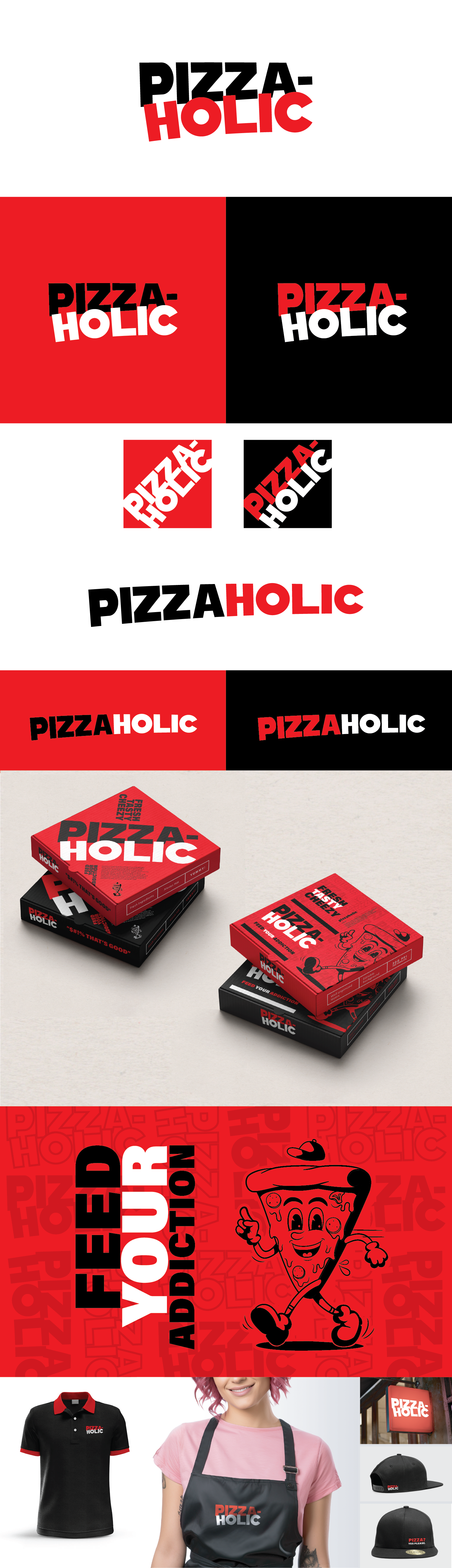
This concept really took into consideration the visual styling of the Papa John’s new logo that you really liked, but we created something unique that could be easily understood, recognized and used across all mediums.
We felt that having the name on 2 lines allowed for better shape and legibility across marketing material.
A 10 letter word is quite long when kept together on 1 line.
We also felt that all uppercase would give more confidence and maturity.
Hyphen or No Hyphen – I felt it gave a bit of a grammar balance with, but can also work without
The cartoon pizza character I think would be a good addition for a focal point of memory. Note: This one we used is a stock image, but we can either have it redrawn to be unique, or use this one.
All elements, fonts and colours can be adjusted and combined.